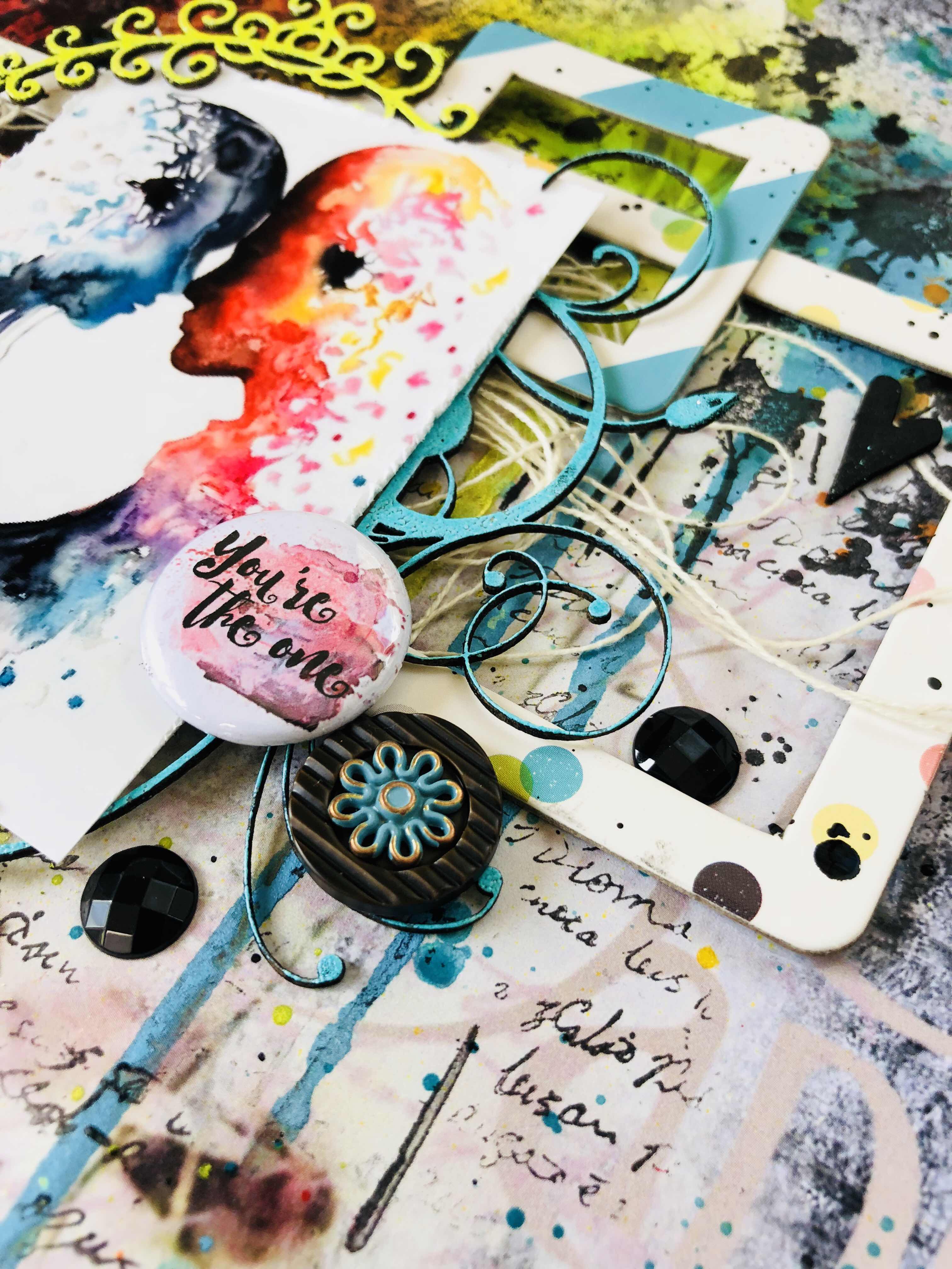
Happy Tuesday everyone.
It’s my share with you all on the SC blog today.
We have such a great challenge this month.
Here is my take.....


I started my layout with a sheet of Paper Arts - Black & White 1.
It’s such an awesome sheet of paper as most of the ‘background’ work is done for you.
Then I wanted to create colour drips and sprays in behind my layers so I did this with a variety of products, such as Heidi Swapp colour shine, Kaisercraft must in red and yellow, distress oxide in broken china.
You can see how I did this in my video link at the end of the blog.

I also flicked a few of these colours over and around to really bring colour to the center of the page. To create a bolder colour I used a couple of Dina Wakley acrylics in ruby and Tangerine to add body to the flicks.
I then use a couple of stamps that look like splats over the ink colours and build with these.

Under the photo I proceeded to layer twine and a few Carpe Diem frames I had.
Staggering these under my photo which is another awesome one I found on Pinterest.
I used a couple of Heidi Swapp Marquee dots and Tim Holtz buttons as the embellies as well as some 2crafty chippy.

And once all glued down I flicked and splattered Liquitex Carbon black ink to tie it all together.
Layout complete!!
I hope this inspires you to have a go of this months challenge, I’d love to see how you interpret it.
And you can see my process video here....
Thanks again for your company and I’ll catch you all very soon.
Em xx

No comments:
Post a Comment