Wednesday, 27 April 2016

You and me - Emma Zappone

Hi everyone, 
Emma here to share my first of what I have been playing with for this month. 

Have you seen this months mood board and kit? 
This is what I created with it and what the board looks like.... 


Super pretty and soft. 
It's a loved up theme, so I used this emotion of love to scrap my gorgeous hubby and I. 

The JAP kit this month is stunning. All of the pieces are amazing, my fave this time is the wood veneer word. I wanted a soft colour on this veneer so I used a spritz to cover it. These veneers are awesome as the colour stays true and doesn't just soak up the colour. 


And because everything is matching in the kit, layouts come together easily. 
I added only a couple of small papers up behind my photo and flicked a bit of ink around the page. 
The flairs also in this kit are just wow! 


My pages are never complete without a flair. 
I hope you got a chance to have a play with this months board. 
Not long before there will be a new one in the D-lish shop. 
I'll catch you all tomorrow for another share. 
Em. Xx


Friday, 22 April 2016

Happy - Emma Zappone

Wow these last 3 days have flown by.
We are already at the end of yet another month.
Today I'm sharing something slightly different for me.
 
 
I have used black, and only gold and brown tones.
I absolutely loved creating this one.
The photo is one of my faves but I love love love the Gold!!
And it was a great way to use some awesome D-lish flowers.

 
I think the pip berry stem made for a great frame around my photo and was complimented by those mini rose blooms.
I have had the Gold flair for a little while and it always felt a little lost on some of my brighter coloured layouts, but on this one it was just perfect along with the muted felt bow.

 
On my 'happy' word (just one of the awesome wood veneer words in the shop at mo) I thought I would try a different approach. I painted it with the gold, but while it was still wet I pressed in some actual gold leaf. A friend of mine had given me some to play with. It's a little tricky to use but I really love the texture it gave as well as the awesome shiny Blingy look it has.
I finished it all off with a few resin butterflies trailing up the page.
It's minimal, condensed and pretty.
One of my faves created so far.
I hope you all have a creative new month and I look forward to seeing you all in May.
Till then, Em. Xx


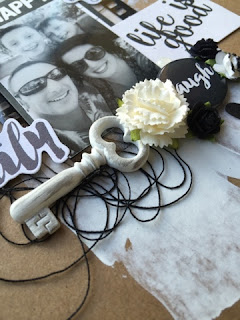
Life is good - Emma Zappone

Hi all,
Im here today with my second share. This one came together rather quickly.
D-lish has so many awesome washi tapes, either I've ordered them or they have come through in the JAP kits, that I thought I should showcase a few as my 'paper' element behind my photo for a change.
 

Some who know me, know I love to layer and washi is an instant layer! And you can keep adding and layering. Also I felt it suited the relaxed feel of the photo. I did add some tissue paper and a bitty bag up behind my photo as a matting and used one of the awesome Dusty attic chipboard pieces for my title.


And I think those beautiful coloured wood butterflies are just perfect to pretty a page up.


The camera flair is just the cutest and that reminds me I really must order more...lol.
I tied it all together with some green enamel dots and a few extra embellies and quotes.

 
It was a great way to use up some washi, I have so much of it and just placing a bit here or there just doesn't use up enough. I really love how all the colours pop off this page especially the Orange felt bow. 
I'm sure you have plenty of washi lying around.
Why not try something similar?
It's a nice alternative to patern paper.
I'll catch you all tomorrow with my last share for the month.
Em. Xx


Family

Hi! 
Today I sat down and created for Kraft + challenges!!! Yippee!! It's been ages since I had a chance to play over there. 
This month the theme is black and white! 
Sounds super easy hey? But it can be a little tricky when you love colour as much as I do. 
Here is my page....
 
 
                         I loved creating for this challenge!! I used lots of products I had deep in my stash. Such as old Prima and distress powders. 

 
I used chipboard from 2 crafty and imaginarium designs. Best of both worlds. 

 
That's the great thing about challenges, it allows you to really 'play' and dig around and use up things you have had sitting around for awhile. 
Hope you like what i have created as much as I have. 
Thanks again Kraft+ team for the awesome inspiration. 
Em. Xx


Sunday, 10 April 2016

Me

Hi!
Today I had a day off! 
So I thought I would try out a challenge I have never tried. 
I chose 'Scrap the Girls'. The mood board this month was just gorgeous. Below is my page inspired by this board....


Stunning isn't it!!! 
This year I'm trying not to be scared of scrapping myself. It to me can seem like I love myself but to my family it's a memory. As my eldest said when I showed him...."Awwww". 
We need to remember we don't just make memories we can also be memories. 

 
I really enjoyed digging around in my stash to play with goodies I don't always get to play with. And I'm totally in love with gold at the moment. 
With a household of boys it was fun to create a girly page, with plenty of pink and flowers!! 


It was great to do something out of my comfort zone and come away with a smile. 
Thanks for taking the time to pop past my blog. 
Em. Xxx


Friday, 8 April 2016

Calm ya farm


Hey there, 
I'm super excited to let you know that Kit The Habit has released their 2nd kit!!!
It's fun, bright and 'crazy'! (Just like us) 
And today I would like to share my first creation with this 'crazy' kit. 
 
 
It certainly matched ourselves and our families! 
I decided to keep it fairly simple to really make the all the colours pop! So I used paint to colour the awesome 2crafty chipboard and I applied paint to the triangle cut file. 
We really wanted to capture quotes we all use, and couple of song lyrics that suit and just a great handful of 'randoms' that compliment all types of scrapping. We have really thought about all Scrappers when putting the quote on the card so it's easy to 'flag' in layers. 


                              And we are really excited to introduce acrylic elements into this kit.
                                                                  How awesome right?? 
I added just a couple of flowers from my own stash just to really make our acrylic cactus look even more amazing. And the mini 'plus' acrylics work super awesome in place of the more traditional enamel dots.
  
Here is the full kit and what it contains 
 
 
We still have some for sale, you can find them on our facebook group here 
 
I will be back in the next week to show another creation from this kit.
And look out for Tammys amazing layouts she creates with our kit also. Her scrapping is totally inspiring. 
Till we catch you next time, 
Em. Xx


Love

Happy Monday everyone!
It's so nice having this long weekend, hopefully maybe a little scrapping happened also for you all?
Today I share my first layout for the month. 
It's inspired by the colour board challenge that Sonia put together for our cyber crop. 


I was instantly drawn to the colours! Not really colours I play with often but couldn't wait to play. 
We had just been to the Adelaide Zoo and just had to scrap one of my fave animals the Chameleon. It happened to be a gorgeous girl so hence the amount of pink. 
 
 
I also got to use many D-lish goodies, like the array of flowers. 
The mini roses are my fave, they come in so many colours and add just the right amount of pretty I need for someone who doesn't get to use them often. 
 

The pip berry stem and cute purple bow helped with the colour theme very nicely. And I used a couple of the glass cabachons as water droplets because this little lizard had a few on her body and wanted the theme of her to go right through. 


Some journal tops and bitty bags helped complete and compliment this page. 
I really enjoyed playing along with this challenge and breaking out the girly and pretty. 
Have you had a chance to play with any of the awesome challenges up at the Scrap Suite yet? They really do inspire. 
I'll catch you tomorrow with another share. 
Till then, Em. Xx


Fun in the Sun

Hope your Tuesday has started off terrific.
It's hard to get started after a long weekend hey?
Today I'm going to show you a very bright remember the summer layout.
It's inspired by this months D-lish JAP kit.


Such an awesome kit yet again, and so much to play with.
And that orange crochet banner....hello awesomeness! 

I chose the yellow background so that the blues and orange popped more then the yellow elements, but I do like how the yellow punchinella is a nice bit of shine layered underneath.

Also teaming up with the nice big piece of wood veneer for a title really brought the page together.
I did have fun with my paint dribbles, I have not played with this technique for a little while and thought because I've used a water photo it might be fun. And how cute are those clouds.


And finally I added a few of the clear cabochons as droplets.
I'll catch you all tomorrow for my last share of the month. 
Have an awesome day.
Em.xx


Real Life

Hi all you fantastic D-lish fans.
Today I'm sharing with you my final layout for this month.
To me it's a simpler page with real pops of colour.
 
 
I love greens and orange with the earthy tones. To me it says country life.
I really supported the arrow theme here using the Dusty attic chipboard arrows cut to size and painted, and the Kraft arrow flair.

 
 The bitty bags were the inspo of the pops of colour and I roughly chopped up some punchinella into my layers. I just love using journal it's and I feel a page is not complete without one....or three! Lol! 


My title I simply painted one of the Dusty Attic chipboard titles, these are just so awesome.


I hope you have an amazing month, and hope that myself and the awesome D-lish team can inspire and help you get that creativity flowing.
I'll catch you all in April.
Em. Xx

Rock on

Hi there, 
It's already April, so that means a new challenge over at 'Show us your Stuff'. 
This month it's all about stamping!
I think it's an element that just never expires. 
Here is my take on this current challenge. 


Our sponsor is stamping up this month, hence the inspo. 
I never get tired playing with stamps, it adds layers and textures without actually doing just that!


But I especially love stamping over texture, such as gesso or modeling paste. 
It just stands out more. 

 
I used 3 different stamps on this page. I really enjoyed grunging it up for this challenge. 
And this photo of my youngest certainly helped. And I created my own flair by stamping on some paper and then making it into a very useable flair.
 
I and all the team at SUYS would love to see what you create with this challenge. You can find us over at http://showusyourstuff.blogspot.com.au/2016/04/april-challenge.html?spref=fb&m=1
 
What are you waiting for lets get stamping!!! 
Luv Em. Xxx