Well hello there SC peeps,
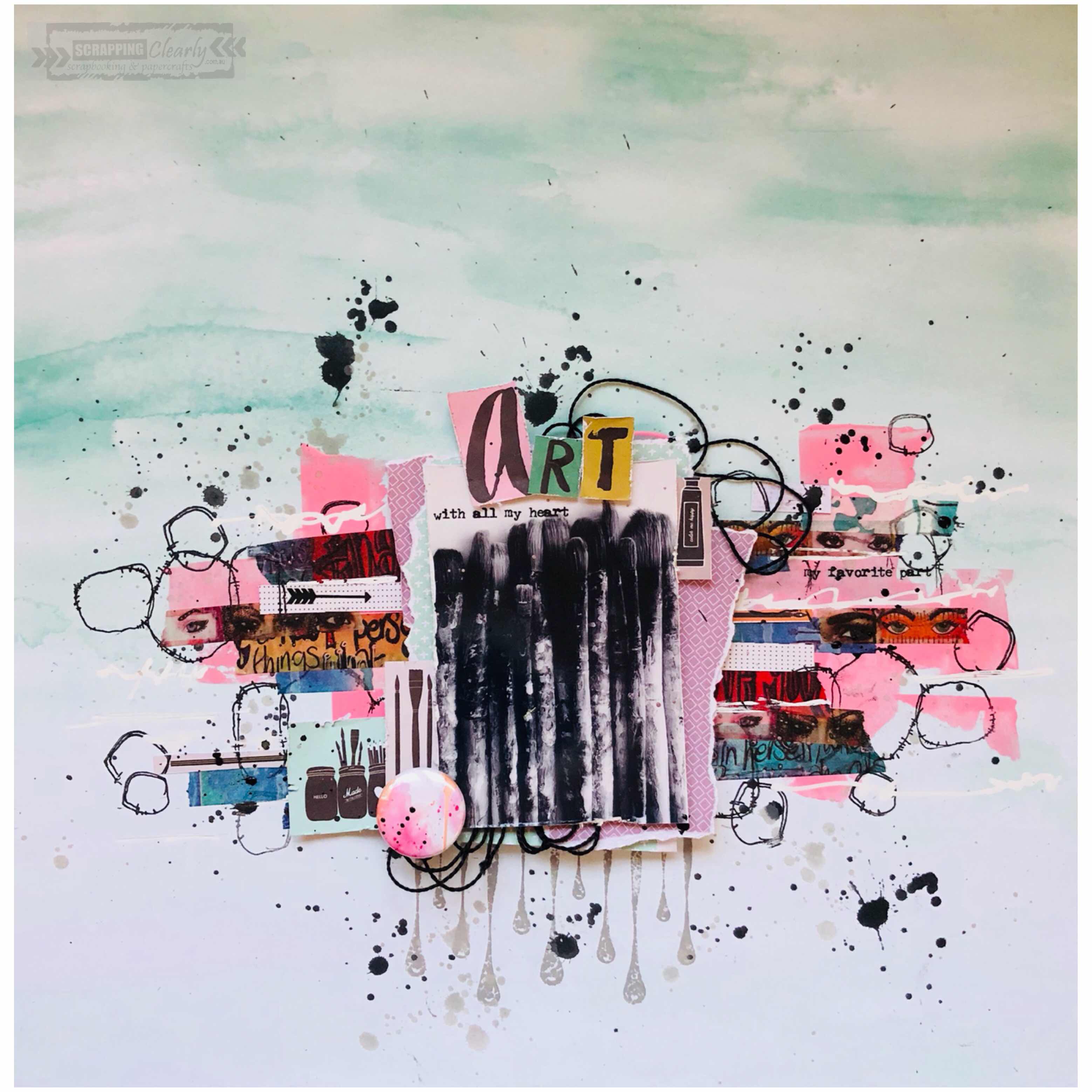
Emma here today to share with you a very easy quick layout.
It is roughly based on the colour scheme of this months moodboard. And I guess to some degree I was loosely inspired by the ‘stripes’ on the page also 😜
I’ll show you what I mean.......


As you can see the colours are there and then the stripes are the washi tape I used.
I started the whole thing by choosing a sheet from Heidi Swapps Pineapple Crush range in Breezy.
So to get started with colour I used some Dylusions Rose quartz paint first as my base ingredient.
Then once dry I tore strips off 3 of the tapes you can find in the Dylusions washi tape pack. These totally rock!!

Then came a little bit of stamping around the area already created.
This page I chose to use only a couple of ripped pieces of paper from pink paislee memorandum pad up behind my photo.
And then to use as my ‘embellishments’ I used a sheet out of that same pack but cut out all the imaging and letters. These also became layers in my washi tape and as my title.

I also added some random pattern by using liquid paper pen to doodle (inspired by the ever awesome Lisa Oxley)
And a few of the Tim Holtz rub ons in amongst the washi and as part of my title.

I didn’t care if when I flicked the Distress Oxide around it went on my photo as it was to really showcase art.
I chose to use hickory smoke for this so that it didn’t over power the image.
And then I flicked the carbon black liquitex ink once I covered by photo.

I’m pretty happy with the outcome. What do you think?
It’s not perfect but hey that’s ART! 😜
I really look forward to seeing your interpretation of this months moodboard and I’ll be back later on this month to share another layout inspired by the moodboard.
Catch you then, Em xxx


No comments:
Post a Comment